Kelly Lin

Tiny Terra
Overview
Tiny Terra is a casual, single-player farming and puzzle game made for PC. The game requires an intuitive, engaging, and aesthetically pleasing interface to enhance the overall player experience. The user experience includes meta gameplay, visual hierarchy, conceptual goals, as well as UI design for the HUD, quests, interactables in the environment, shop, fishing, collection, postcard, inventory, menu, and more.
Studio: Mystic Minds Game Studio
Platform: PC (Keyboard/Controller Support)
Responsibilities: User Research, UX design, UI design, UI Art, UX audio, VFX, UI development
Engine and tools: Adobe Suite, Figma, Unity, Jira, Miro, Google Suite
UX Design Process
Define Goal
Create an intuitive, engaging, and aesthetically pleasing interface that enhances the overall player experience.
Competitive Analysis
In most farming game UI designs, it is common practice to distribute primary functional modules across different pages. Additionally, these games often utilize cartoon-style icons to align with the game's casual and adorable theme. These are aspects that can be incorporated into this game. However, I noticed that some competitors' UI designs lack distinctive features that deeply integrate with the game's theme. Many of these designs simply present functions without unique characteristics, failing to highlight the game's unique charm and emotional design.
Focus Group
I conducted a focus group with casual gamers to gain insights into their needs and preferences by asking specific questions.
Some of the questions I asked include:
- What are your thoughts on other farming games?
- Do you encounter any issues or challenges when using them?
- What are your expectations for the User Experience (UX) in this game?
Insights
After conducting the focus group and analyzing online blogs to gain insights into player experiences, I discovered several challenges and desires in farming game UX design.
For example:
- Cluttered or confusing UI design can make it difficult for players to navigate menus or access essential features efficiently. Players want a simple and clear UI design that allows them to easily navigate menus, manage inventory, and efficiently access essential features. 40% of players mentioned that they would like a tutorial at the beginning to guide them on how to access these buttons.
- Repetitive UX effects lack variety, making players feel bored and frustrated. Players hope to have an engaging UX to keep their interest.
- Some farming games have overly crowded screens with too many elements competing for attention, making it difficult for players to focus on completing tasks. Players hope for screen layouts with fewer buttons competing for their attention.
Create User Personas
Persona 1: Casual Gamer
Age: 26
Occupation: Marketing Specialist
Background:
The player works full-time in a company and enjoys playing casual games to relax in her spare time. She is familiar with mobile and PC casual games and particularly enjoys farming and puzzle games.
Needs and Goals:
Seeks a game with a clear and intuitive UI that doesn't require much time to learn.
She enjoys games with engaging and varied UX to keep her interested over longer play sessions.
Prefers games that offer a sense of progression and reward without feeling repetitive.
Pain Points:
Finds overly cluttered screens frustrating, as they make it difficult to focus on tasks.
Dislikes when games have confusing or poorly explained features, leading to a steep learning curve.
Frustrated by repetitive gameplay mechanics that don't offer enough variety or challenge.
Key Quotes:
"I want to be able to relax and enjoy the game without having to struggle with the interface."
"I love it when games have engaging graphics that match the theme."
User Flow

Low and Mid Fidelity Interface Wireframes:
Shop Interface Example


Key Aspects Prioritizing
1. Hotbar
Because players frequently interact with the environment, the hotbar is designed to be intuitive and not hidden in a backpack button. This improves gameplay flow and efficiency by reducing the time spent searching for tools in menus. And the design prioritizes simplicity, avoiding any additional decorations to prevent obstructing visibility or adding visual clutter.
2. Player Wallet
Economy management is one of the core gameplay elements. Displaying the player's wallet in the HUD helps players monitor their financial status in real-time, making it easier to make purchasing or investment decisions.
3. Collection and Postcard Button
In the demo version, players cannot access the collection and postcard features from the environment. To ensure players immediately realize they've received rewards after certain actions, these buttons are included in the HUD for easy awareness and access.

Meta Gameplay UX Design
Collection Interface
To set it apart from the typical collection interfaces found in other games, I designed the collection interface to mimic a product catalog book. This is because the player character starts their own business and wrote this book. Every time players find or invent new items, they unlock entries in this catalog. This provides players with a unique experience, but also encourages emotional investment and long-term engagement.

Collection Interface
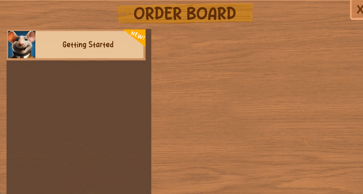
Reward on Quest Board Interface
By presenting quest rewards with quantities marked as "?", it successfully aroused players' curiosity, enhancing their motivation to participate and increasing their anticipation for rewards.

Reward on Quest Board Interface
Emotional Design
Character Emotional Expression
I created several interfaces that showcase the player character's emotions. For example, when collecting rewards, the UI will display the player character's satisfied expression on the side. When coming across locked areas and the player doesn't have the item, the reminding UI will show an upset expression. Additionally, in the case of failing to fish the trash, the fail UI will display an expression like "Wait, what just happened?" These facial expressions allow players to grasp the character's emotional state in different situations, making the game more immersive and emotionally engaging.


Player Character Emotional Expression
Postcard Viewing Interface
The postcard viewing interface depicts the player character as a small figure sitting at a table, enjoying a cup of hot chocolate while looking at postcards. There is a large pencil nearby, adding a playful touch. This design creates a cozy atmosphere, helping players to emotionally connect with the character and the environment.

Postcard Viewing Interface
Fishing QTE
I designed sprites for the player character to follow the corresponding directions on the QTE arrows during fishing. This allows players to emotionally connect and resonate with their characters as they witness them diligently fishing.

Fishing QTE
Conceptual View Design
In the conceptual view of the game's UX, certain features are strategically placed close together to facilitate easy navigation for players. In the shop panel, the shop and currency management functions are both accessible from the same interface.

Shop and Currency Management
Similarly, the menu interface allows players to access overall experience options such as returning to the main menu, adjusting game settings, and viewing control instructions.

Menu
Additionally, in HUD, buttons for similar collection mechanics (Collection and Postcard buttons) are grouped together, making it easier for players to access.

Collection and Postcard Buttons
Text and Description
1. Item Description on Shop Panel
All information regarding items is clearly displayed in the right-hand column.
2. Owner's Message on Shop Panel
The left-hand column shows the shopkeeper and message board, adding an interesting vibe that aligns with the game vision while maintaining a minimal footprint.
3. Controls Instruction (Prototype Ver.)
Designed intuitive, theme-appropriate instructions.


Sign and Environment in Game
Outlines
Given that the scene contains many interactive elements as well as non-interactive decorative items, I designed a themed color outline to distinguish interactive objects. This outline appears when players approach an interactive item. Additionally, in the tuna can farm, the outline helps players intuitively understand which tile they are interacting with.
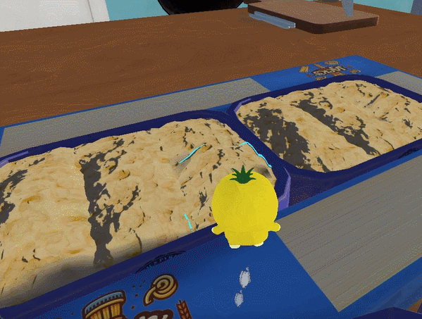
Tuna Can Farm Tile Outline
Environmental Cues
Since the environment content is relatively rich, players might find some paths hard to distinguish. I used environmental elements such as lighting, color changes, and effects integrated with the background story to guide players toward new places.

Path Cues on Microwave and Fridge
Real-Time Feedback
When players perform actions, the game immediately provides visual and auditory feedback to confirm that the actions have been successfully completed.
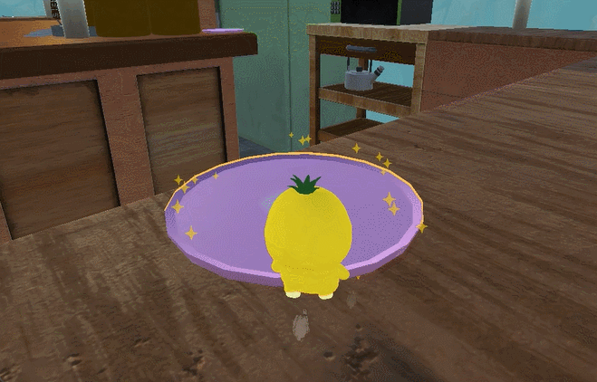
Jello Plate Real-Time Feedback
Accessibility Design
Settings
In the demo version, we offer volume adjustments to accommodate varying levels of hearing ability, as well as mouse sensitivity adjustments to meet players' gaming preferences. The slider handles were creatively designed to resemble the heads of player characters, adding a touch of charm to the interface. Many players have appreciated this design, describing it as one of the cutest they've seen.

First Usability Testing - Identify Pain Points
Using qualitative methods such as user interviews and feedback forms, I identified initial pain points. The main issues discovered were:
-
Players often find the hotbar size too large. Since their characters are primarily located in the center or sometimes slightly lower on the screen, they complain that the hotbar blocks their view while planting.
-
Although the game interface intuitively displays the main interactive functions and includes instructions, 20% of players still wished for button usage tips during onboarding.
-
70% of players did not notice the interaction methods for the collection and postcard game mechanics during the testing phase.
The first and second pain points have been addressed before the prototype playtest. The resolution for the third pain point will be demonstrated in the Testing and Iteration Phase: Prototype Example.

Create Style Guide
After consulting with the art team, based on the overall game art style, I developed a UI Style Guide and Mood Board that align with the established art style and game theme. These resources are intended to guide future creations and serve as a reference for the team. The Style Guide includes the following elements:
-
Mood Board
-
Typography
-
Font sizes for various UI panels
-
Color schemes
-
And more

Create Functional Animations
Design and implement functional UX animations for the Alpha version to enhance the user experience and provide useful feedback. This includes:
-
Interactive feedback animations
-
State transition animations
-
Information conveying animations.

Functional UX Animation Draft for the Quest Board
Check New Quest
Create UI Assets

Testing and Iteration Phase: Prototype Example
Qualitative Methods
-
Player Observation
-
User Interview
-
Feedback Form
Quantitative Methods
-
Time on Tasks
-
Task Success Rates
-
Completion Rates
-
Clicks
-
Correlation Analysis
-
Heatmap
-
A/B Testing


Playtest Session
During the playtest, we followed these steps:
- Ask players to play the game as they usually do: we want them to act naturally instead of trying to “break” it.
- Observe the player and their emotions.
- Ask interview questions.
- Ask the player to fill out the feedback form.

User Interview & Feedback Form
Out of 37 players, 12 did not interact with the collection and postcard buttons on the HUD at all during gameplay. Another 10 players noticed these buttons but did not check them regularly.
16 players felt that the collection and mailbox buttons on the screen were not noticeable enough when new content appeared, causing them to sometimes overlook it.

Descriptive Analysis
During the descriptive data analysis process, we observed some concerning trends in data related to user experience. Specifically, we focused on metrics such as playtime, number of quests completed, number of clicks on the Collection button, number of clicks on the Postcard button, and player satisfaction. We noticed that the click rates for the Collection and Postcard buttons are relatively low. However, it is necessary to delve deeper into whether there is a correlation between these click rates and overall game satisfaction, quest completion rate (as one of the core game mechanics), and player engagement.

Correlation Analysis
To further explore the relationships between these variables, I conducted a correlation analysis and found that the number of clicks on the Collection button is positively correlated with the number of quests completed and playtime. Additionally, the number of quests completed is positively correlated with both playtime and player satisfaction. These results suggest that frequent interactions with the Collection and Postcard mechanisms seem to be associated with higher overall game satisfaction.
Therefore, increasing the click rates for these two buttons is crucial for enhancing player satisfaction, which is closely related to game design. This should be prioritized at a medium-high level.


Heatmap
The generated heatmap images also confirm the above conclusions—the Collection and Postcard buttons did not receive the expected number of clicks. Additionally, many players prefer interacting with the hotbar using the mouse instead of the recommended scroll wheel and number keys.

A/B Testing
Based on the test results, I conducted A/B testing to improve the collection button and the postcard button. The process was as follows:
Set a Goal: Determine if adding animation cues to the buttons can increase their click-through rates.
Formulate Hypothesis: Hypothesize that version two will result in a higher click-through rate.
Design Versions: Create two versions. The first version uses arrow animations to draw attention to the buttons. The second version adds animations to the buttons without extending beyond them.
Assign Random Groups: Randomly assign players to different test groups.
Gather Data: Collect user behavior data, game metrics, and player feedback.
Analyze Data: Use statistical methods to analyze the collected data and determine if there are significant differences between the versions, thereby validating the test results.
Results: Both versions increased click-through rates. However, some players reported that the frequent appearance of arrows in the first version was visually distracting. Consequently, the team decided to adopt the second version.
